Layout and spacing
One phone-width column, 480px at most, with a 20px gutter that grows to clear the notch. Corner radius says what a shape does, and the play surface never moves under the thumb.
How it works
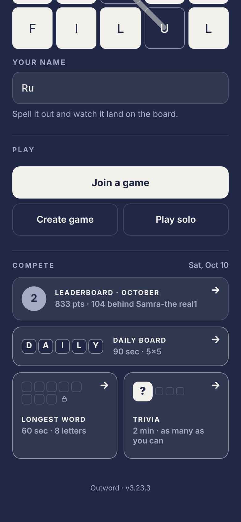
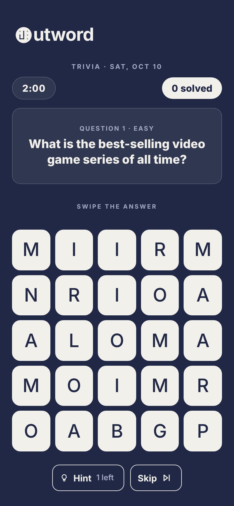
Outword is laid out for a phone. Every screen is a single column, and every release is tried at two sizes before it ships: 390×664 and 320×568. The screenshots in these docs are 390×844, captured at 2×.
| Part | Value | Code |
|---|---|---|
| Column | max-width: 480px, centred | .app |
| Side gutter | max(20px, env(safe-area-inset-left)), and the same on the right | .app |
| Top | env(safe-area-inset-top) + 32px | .app |
| Bottom | env(safe-area-inset-bottom) + 20px | .app |
| Height | min-height: 100dvh, with 100vh as the fallback | .app |
| Header | at least 52px tall, 12px between items, 20px below | header |
| Action bar | fixed to the bottom; 16px above the buttons (--bar-pad), the safe area plus 16px below; the same 480px column and 20px gutters as the page | .actionbar, .actionbar-in |
| Bottom sheet | full width up to 520px, at most 88% of the viewport tall; head padding 24 / 16 / 20, body 16 / 16 / 4 | .modal |
| Sheet foot | 16px above; max(16px, 8px + env(safe-area-inset-bottom)) below | .modal-foot |
| Sheet with no foot | 4px + env(safe-area-inset-bottom) under its body | .modal-body:last-child |
Safe areas
The page runs edge to edge (viewport-fit=cover), so the CSS clears the notch, the Dynamic Island and the home indicator itself with env(safe-area-inset-*):
- The page adds 32px under the top inset and 20px over the bottom one, and its gutters never shrink below 20px.
- The action bar sits 16px over the bottom inset.
- A sheet's foot sits 8px over the home indicator, which already reserves room of its own. Where there's no inset to sit on (a desktop, an iPhone SE, Android with hardware buttons) it falls back to 16px. A sheet with no foot adds the inset under its body (3.25.4). While a keyboard is up, sheets sit on top of it (
--kb) and drop the inset. - Toasts drop in 14px under the top inset.
Short and narrow screens
Two media queries respond to the screen's size. Each one changes a single screen.
| Query | Screen | What changes |
|---|---|---|
max-height: 760px | Trivia | Question 20px → 18px; the card's padding 14 / 16 → 12 / 14 and its top margin 14 → 8; the slot's margins 18 → 12; the buttons sit 14px under the board instead of 22; the board is capped at 300px wide |
max-width: 360px | Help sheet | Padding 24 / 18 → 20 / 16; its demo tiles 44px with 19px letters |
max-width: 360px | Code panel | The code's tiles 42px → 38px with 19px letters, so six fit the panel at 320 (3.25.4) |
Both test sizes are under 760px tall, so the tightened trivia layout is the one testers see. The results screen doesn't use a query: it measures its own action bar at runtime (--bar-h) and sizes its scrolling area to leave exactly that much room, plus 96px.
The board
The board is a CSS grid, gap: 8px, 4×4 or 5×5, that fills the column. Tile sizes at common widths, computed from the CSS:
| Phone width | Column | 4×4 tile | 5×5 tile | Trivia, under 760px tall |
|---|---|---|---|---|
| 320 | 280 | 64.0 | 49.6 | 49.6 |
| 375 | 335 | 77.8 | 60.6 | 53.6 |
| 390 | 350 | 81.5 | 63.6 | 53.6 |
| 430 | 390 | 91.5 | 71.6 | 53.6 |
The smallest tile in play, a 5×5 tile on a 320px phone, is still above the 44px target floor.
Spacing
The spec describes a 4px base grid with common gaps of 8, 12, 16, 20 and 24. The code tells a different story. Counted across every padding, margin and gap in the game's CSS, 279 of 537 values sit on the 4px grid and 258 don't:
| Value | Uses | On the 4px grid |
|---|---|---|
| 8 | 74 | yes |
| 12 | 62 | yes |
| 16 | 57 | yes |
| 10 | 54 | no |
| 14 | 52 | no |
| 4 | 43 | yes |
| 6 | 35 | no |
| 2 | 29 | no |
| 20 | 14 | yes |
| 24 | 10 | yes |
The eight most used steps are every even number from 2 to 16. In practice the system runs on a 2px sub-grid, and 10 and 14 are as much a part of the rhythm as 8 and 12.
Some rhythms are written down, in the code or the spec:
| Where | Rhythm |
|---|---|
| Sheet head | 24 above the title, 4 to the sub, 20 down to the rule, 16 under it (3.9.1) |
| Lobby | 14 between blocks, 16 either side of the settings group |
| Compete cards | 14 padding inside a 1px border, 10 between cards and between the paired cards |
| Trivia | the slot is 40 tall with 18 above and below; 22 from the board to Hint and Skip, 10 between them |
| Board | 8 between tiles |
| Paired buttons | 8 between them (.action-duo) |
Corner radius
Radius tells you what a shape does. Square is tap, pill is read, circle is rank: buttons and fields are rounded squares, a pill holds a live value, and a circle is a place in the standings. No button is ever circular.
| Radius | Rules | Job |
|---|---|---|
| 12px | 37 | Buttons (primary, secondary, icon), fields, standings rows, toasts, the podium columns |
| 999px | 15 | Pills: the timer, the score, the word pill, small tags, the hint tag |
| 14px | 10 | Tiles, room rows, Compete cards, the trivia question card, the recovery code panel |
| 50% | 11 | Rank circles (.place), the key's dot and its ring |
| 8px | 6 | Chips, the name tiles on "Is this you?" |
| 16px | 6 | Larger panels: the winner banner, the dictionary verdict, the code picture |
| 10px | 5 | The segmented control, the recovery code tiles, the error box |
| 2px | 5 | Thin rails and rules, such as the solo best track |
| 18px, top only | 1 | The bottom sheet |
| 22% | 3 | Confetti tiles, board tiles scaled down |
Some small copies of the tile keep a proportion rather than a pixel value: Compete card tiles round at 28% of their size, confetti tiles at 22%, and the help sheet's thumbnail boards scale every tile value by 24/52.
Touch targets
The rule is that every interactive element is at least 44px in its smaller dimension. One control breaks it.
| Control | Size | Class |
|---|---|---|
| Primary and secondary buttons | at least 52px tall | .primary, .secondary |
| Fields | 52px tall | .field |
| Icon buttons, the sheet's close | 44×44 | .home-icon-btn, .modal-x, .row-x |
| Icon and label buttons | 44px tall | .icon-secondary |
| Hint and Skip | 44px tall | .tv-btn |
| Segmented control | at least 44px tall | .seg button |
| Text buttons | at least 44px tall | .text-btn |
| A tile | 49.6px or more | .tile |
| "Clear" in the word log | 32px tall (under the floor) | .text-btn.small |
Rules
Why it's built this way
Known issues and gaps
From the 3.23.6 audit, plus what turned up while writing this page:
- The 4px grid isn't the real grid. 258 spacing values fall off it, and 10, 14, 6 and 2 are among the most used steps. Planned fix: document the 2px sub-grid honestly, then make the common steps tokens.
- No radius tokens. 21 distinct values against a documented ladder of 12, 999 and 14 (plus 8, 10, 16, 18 and 2). The strays still rendered are 1, 4, 6, 7 and 9px; 11, 13, 15 and 22px appear only in CSS nothing renders. Planned fix:
--radius-sm8,md12,lg14,sheet18,pill999, and map the strays. - The spec's gutter is wrong. It says the page gutter is
--bar-pad(16px). The code's gutter is 20px;--bar-padis the action bar's and the sheet foot's vertical padding. The trivia spec uses the same 16 and puts the question "33px from each screen edge (16 gutter + 1 border + 16 padding)"; it's 37px, and the CSS comment on.tv-q("main gives 16") is stale. - The spec's sheet rhythm is from before 3.9.1. It gives the head as 20 / 4 / 16 / 12; the code has been 24 / 4 / 20 / 16 since 3.9.1, and the comment above
.modal-headstill says 20 / 4 / 16 / 12. - A height query the code itself warns against. The help sheet avoids
max-heightqueries on purpose: Mobile Safari changes the viewport height as its bars show and hide, so a height query can flip while you scroll and resize the board. Trivia'smax-height: 760pxquery (3.22.1) is that kind of query. Whether it flips on a phone near 760px hasn't been checked. - The help sheet ends lower than the other sheets. Its CSS says its bottom padding is
.modal-foot's expression "verbatim", and it was in 3.9.1. The foot has since moved tomax(16px, 8px + inset)while the help sheet keptmax(16px, inset), so on a phone with a home indicator the help sheet ends 8px lower than every other sheet. - One tap target under the floor. "Clear" in the word log is 32px tall. Planned fix (3.23.7):
min-height: 44pxwith the same visual text.
Related
- Typography: what sits in the column
- Tile: the board's one shape
- Sheet: the bottom sheet's head, body and foot
- D-004, the question card: the rule that the play surface never moves